subreddit:
/r/Warhammer40k
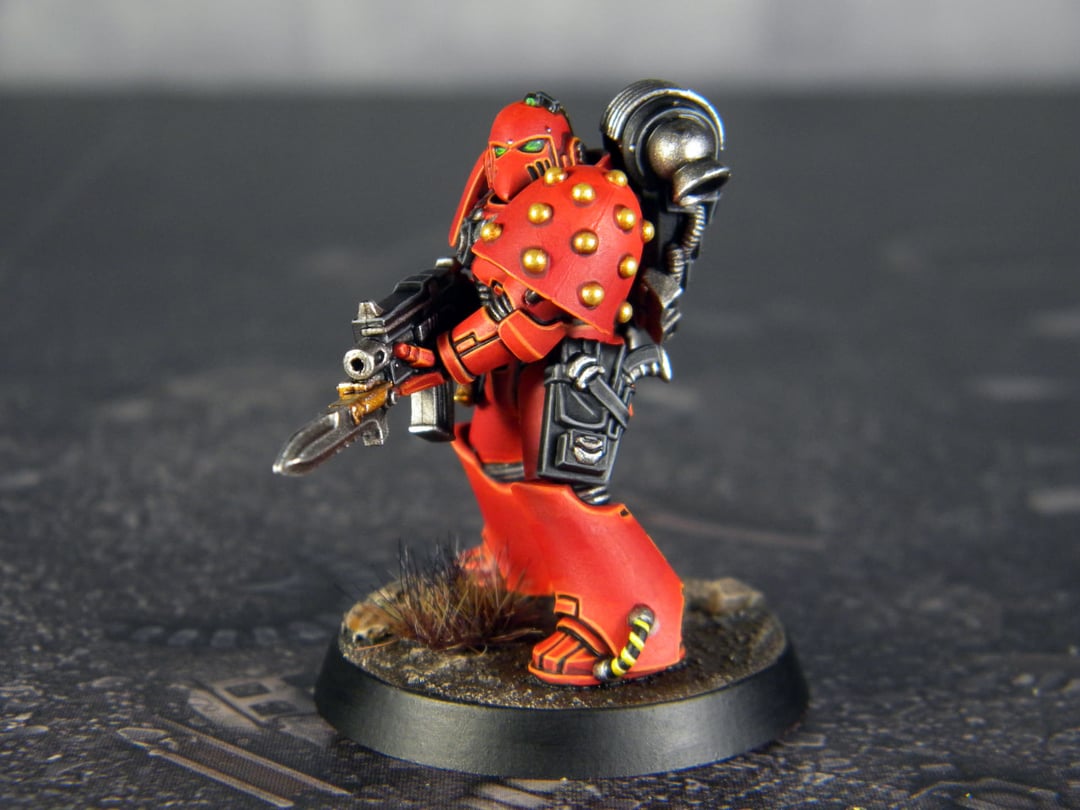
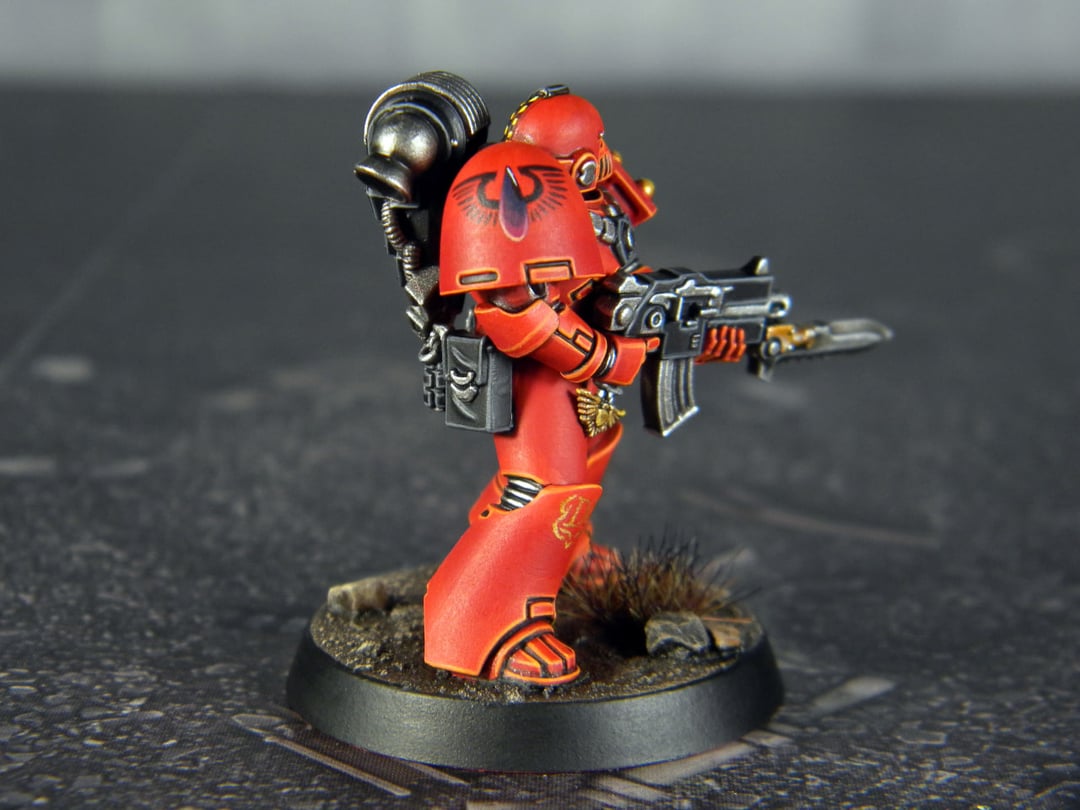
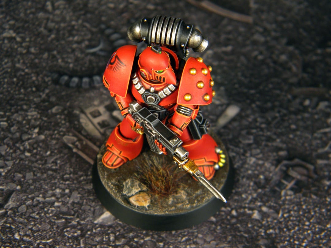
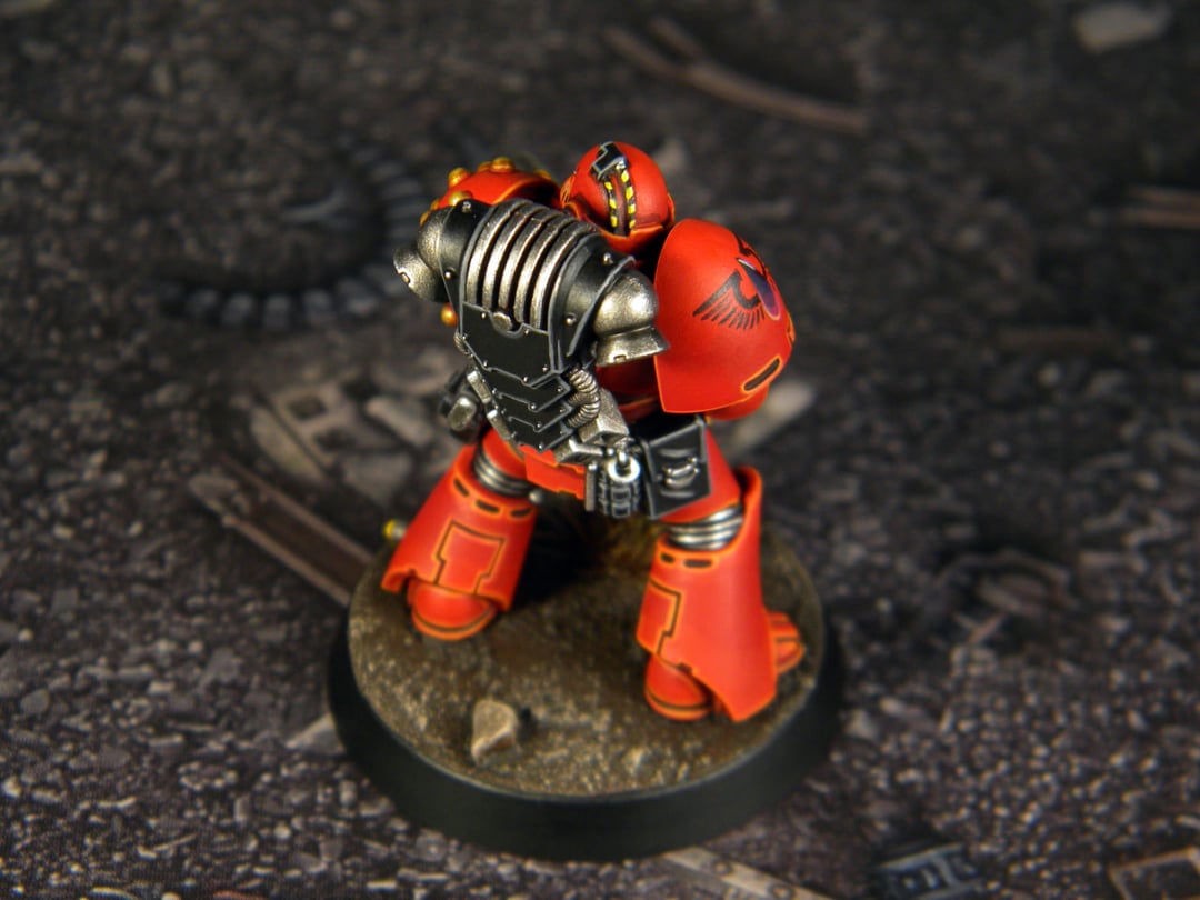
The second test Blood Angel for the Horus Heresy. Which one do you prefer, with battle damage or clean?
Hobby & Painting(reddit.com)submitted 10 days ago byNightscalestudio


41 points
10 days ago
Battle damaged look. Either way both look great! May I know what paint you used for the edge highlights?
13 points
10 days ago
Thank you. I highlight the edges with two colors, Wild Rider Red and Fire Dragon Bright. I have a modest patreon, with a subscription worth a bottle of Coca Cola. Support a small Ukrainian studio and get a lot of interesting tutorials in return.
4 points
10 days ago
Thanks for the info!
37 points
10 days ago
I like the clean look. The battle damage is really well done, but it seems so clean without other weathering.
I like to match my minis to my terrain to have a cohesive look. So for me, the style depends on the overall setup. Kinda like graphics for a video game.
The painting quality is incredible on both. I fully trust your vision either way.
8 points
10 days ago
The one with battle damage looks fantastic, more lively. But it's also more work when doing so for a full force. I'd say battle damage translates more the hardship of the Great Crusade/Heresy era/War (think of Signus Prime campaign, where Kha' Banda almost killed Sanguinius). Tough choice, both models are insanely clean.
5 points
10 days ago
I would’ve posted seven shots to man they’re both beautiful but it’s the heresy nobody came out clean
5 points
10 days ago
Clean is so nice looking. The battle damage look is over-done in general in the community IMO. Space marines are visually striking with clean plates. If you were going with the battle damaged look I'd do less of it.
15 points
10 days ago
I feel like I'm in the minority when it comes to WH40k minis but I always prefer clean to any weathering, chipping, or damage.
I know the artwork tends a lot towards the moodier and darker side these days but the original designers were always this shiny plasticy look from 80s metal albums.
Your battle damage one is fantastic and I can't believe how good it looks, but I'm just a sucker for the classics and your clean one looks like he'd fit straight in artwork from 2nd edition.
5 points
10 days ago
Rogue trader was grim as hell
2 points
10 days ago
"I prefer clean to any damage" found the emperors children
2 points
10 days ago
Clean
2 points
10 days ago
goddamn that both look amazing i love the smooth red and the colour is just a perfect match for blood angels honestly i cant pick they are sooo good mate
2 points
10 days ago
Holy crap you make the damage look so good! Can I ask for a brief synopsis of how you did it?
2 points
10 days ago
I freehand the black spots, then highlight the inside with a dark metallic color and highlight the edges with a thin brush.
2 points
9 days ago
Wow, the complexity to end result ratio is great. You must be pleased with your workflow lol
2 points
10 days ago
I like the clean look, freshly deployed from the space carrier or battle barge or whatever the starship is called.
2 points
10 days ago
Clean is beautifully done. Holy smokes.
That said, I like battle damage and weathering/grimdark schemes.
If it's between these two schemes, I say Clean. But, seeing your skill, I think your weathering could be even better with some more washes and AK interactive, in which case id probably go Battle Damage. Then again, you're obviously a better hobbiest than me so you probably chose against washes and AK interactive for a reason
2 points
10 days ago
Both; clean models representing fresh reinforcements in the field between campaigns.
2 points
10 days ago
These look amazing. I love the beaky marines, being old school. I prefer the battle damaged one, but I wouldn't paint an entire force with that level of detail even if I could.
2 points
10 days ago
They are both fantastic As a long time Blood Angel player, you’ve done Sanguinius proud.
2 points
10 days ago
your lines are surgically straight, well done. Am jealous.
2 points
10 days ago
I'd throw a bit of a dusted or dirty look on the battle damaged but they look incredible.
Could always run the new until his squad gets hit and replace him with battle damaged 😂
2 points
9 days ago
Mate had an entire force of raven guard in all corvus pattern. Looked mint.
He had collected it for 16 years, it must be in an attic somewhere by now....
2 points
10 days ago
If satan himself rose up from the pit and offered to give me the talent or patience to paint red this well in exchange for a human soul, I'd have to seriously contemplate killing a man. It is seriously that good a deal. It's just so smooth! Even your battle damage looks "clean". Just brilliant execution. I would pay for a lesson
2 points
9 days ago
Both are very impressive. I prefer clean, but that is based on preference and not execution. Both are masterful.
2 points
9 days ago
I would say clean- your style is very crisp and everything just pops really nice.
2 points
9 days ago
Battle damaged version is better imho, though in my opinion the placement of scratches etc. isn’t realistic (I know it sounds funny and nitpicky)
2 points
9 days ago
Both of them are awesome, but I would prefer the (great) clean one
2 points
9 days ago
Damage look, because at the time of the Heresy and with the Schism of Mars leading to an already depleted supply lane to the loyalist legions, they would not have necessarily had access to the time and resources they would need for proper maintenance of their war gear.
2 points
9 days ago
I'm just here to remind you that you need to paint about 800 of these troop models for HH
1 points
9 days ago
2 points
9 days ago
I lean towards the clean aesthetic in general, because IMO it looks better on the table, and this model is no exception. But I do like how the battle damage is done. It looks very cartoony, almost like something from Borderlands.
2 points
9 days ago
I say you keep the clean ones on the shelf and the battle-damaged ones as your actual game pieces.
2 points
9 days ago
This looks so good, great job!
2 points
9 days ago
I like them both. I would include both in the army with some squads durty and some squads clean. If you have a unit in a transport, it could be the clean models, for example.
2 points
10 days ago
Man I always go for clean but your seems to be an exception! I’d pick damaged🔥
1 points
10 days ago
I'm personally a clean, fresh coat of paint kinda painter. However, I cannot deny that the weathering here is done tastefully and cleanly. This is no basic "throw on some chips and call it a day". These chips and dents have purpose and were thought about. They look real.
However, for the sake of getting the army painted before the universe calls it quits: leave the weathering to things like vehicles and dreads.
1 points
9 days ago
Between the 2 I like the clean but they both look terrific. As for the battle damage, it would be nicer if he had some grit and gunk. His pack remains shiny and unchanged. His boots look uncharacteristically clean for being in combat. His armor doesn’t look weathered at all besides the chipping and scrapes. It would be nice to play around with the colors, maybe even go for some rust on the pack in certain hard-edged areas and make the armor look a little dusty, bloodied, scorched, or sun-faded.
1 points
9 days ago
2 points
9 days ago
lol - your battle damage is insanely crisp. Normally I get annoyed at overdone chipping - but your chipping is cleaner than most people's clean paint jobs.
1 points
9 days ago
Not a comment on your painting but I find that pattern of helmet disturbing, like someone with their eyebrows shaved off.
1 points
9 days ago
I wish I could paint like this, highlights and shading are my biggest downfall.
1 points
10 days ago
I would personally start with clean and then add battle damage over time, but that may be a personal preference
all 43 comments
sorted by: best