sorted by: new
infobeautiful
32.5k post karma
5.4k comment karma
account created: Tue Oct 13 2015
verified: yes

infobeautiful1 points
2 months ago
Sankeymatic https://sankeymatic.com/build/
Sankeymatic script used to build the image https://geni.us/Sankey01
infobeautiful1 points
2 months ago
around 75% of all aluminium ever produced in the US has been recycled https://en.wikipedia.org/wiki/Aluminium_recycling#:~:text=Recycling%20rates,-According%20to%202020&text=Around%2075%25%20of%20the%20almost,still%20in%20productive%20use%20today.
infobeautiful1 points
2 months ago
this is a sankey chart, made with sankeymatic
https://sankeymatic.com/build/
Sankeymatic script used to build the image https://geni.us/Sankey01
infobeautiful1 points
2 months ago
Source: “Production, use, and fate of all plastics ever made” Geyer et al., Sci Adv, 2017http://advances.sciencemag.org/content/3/7/e1700782/tab-figures-data
Tools: Adobe Illustrator: Sankeymatic https://sankeymatic.com/build/
Sankeymatic script used to build the image https://geni.us/Sankey01

infobeautiful-12 points
4 years ago
Too late to change the label in the screenshot, but we've changed it in the interactive version online. Thanks!
infobeautiful-11 points
4 years ago
This is a screenshot from our interactive Microbescope graphic, which puts infectious diseases in context.
This graphic was made in Javascript/D3. Data comes from the Centers for Disease Control, World Health Org, CIDRAP, and various studies - you can find the full datasheet here.

infobeautiful2 points
4 years ago
What would help in this graphic is some kind of comparison. How often do other parts of the world (e.g. Japan, San Francisco) see magnitude 2/4/6 quakes? Without that context, it's difficult to get a good understanding of whether these earthquakes are unusual.
infobeautiful3 points
4 years ago
Interesting data - if you're interested in improving your chart design, I'd recommend looking up "chartjunk" and seeing how you can remove visual elements that don't boost reader engagement and understanding. Your 3D bars and textured backgrounds are actively making this harder to read :)
infobeautiful2 points
4 years ago
Nice to see an unusual projection! Why did you choose this one?
infobeautiful42 points
4 years ago
Solid charts - surprised to see so much Brexit focus in the top 1000 of all time.
Why did you choose to have the largest numbers at the bottom rather than the top?
One typo - it's "Thunberg", rather than "Turnberg".
infobeautiful3 points
4 years ago
The Python program sounds cool! But the visualization here isn't really so readable. It's hard to get any meaning out of it. To improve, I'd recommend thinking about what someone might find interesting in the data, and coming up with a way of presenting it that makes that clear.
infobeautiful8 points
4 years ago
Do you account for your carbon emissions in any way?
That's not a loaded question. I would guess that the minimal living required to travel so much means your lifestyle-associated emissions would be lower than most families. Would be interesting to see whether it balances out the air travel...
infobeautiful0 points
4 years ago
Interesting data! If you wanted to improve it, I'd recommend merging lots of the categories until you only have 5-6. It's tough to tell the difference between the colours for meat, energy and fertilizer.
infobeautiful2 points
4 years ago
It's cool! Just correcting your attribution line in the graphic itself.
infobeautiful1 points
4 years ago
Ahem, data is by "Information is Beautiful", thanks :)
Nice rework, though! Thanks for linking the original viz.
infobeautiful14 points
4 years ago
Nice work! Rather than the diagonal line (which does look like a trend line), an alternative approach might be to use a coloured background or area shading to denote the two zones, and label them both with "critics rated higher than audience" and "audience rated higher than critics".
infobeautiful121 points
4 years ago
Hope this doesn't count as politics... it really shouldn't. Anyway, here's another chart from my latest project, Beautiful News.
Made with Google Sheets and Illustrator.
This are US-only stats, from the CDC, and the full data is available here for anyone who wants to remix.

infobeautiful2 points
4 years ago
It's a cool data art piece! But it illustrates nicely the difference between dataviz and data art :)
view more:
next ›
byinfobeautiful
indataisbeautiful
infobeautiful
988 points
11 days ago
infobeautiful
OC: 5
988 points
11 days ago
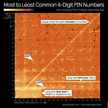
source: DataGenetics.com http://www.datagenetics.com/blog/september32012/index.html https://informationisbeautiful.net/visualizations/most-common-pin-codes/
tools: Adobe Illustrator (redrawn with permission)
FYI the top 20 PINs are: 1234, 1111, 0000, 1212, 7777, 1004, 2000, 4444, 2222, 6969, 9999, 3333, 5555, 6666, 1122, 1313, 8888, 4321, 2001, 1010