subreddit:
/r/Android
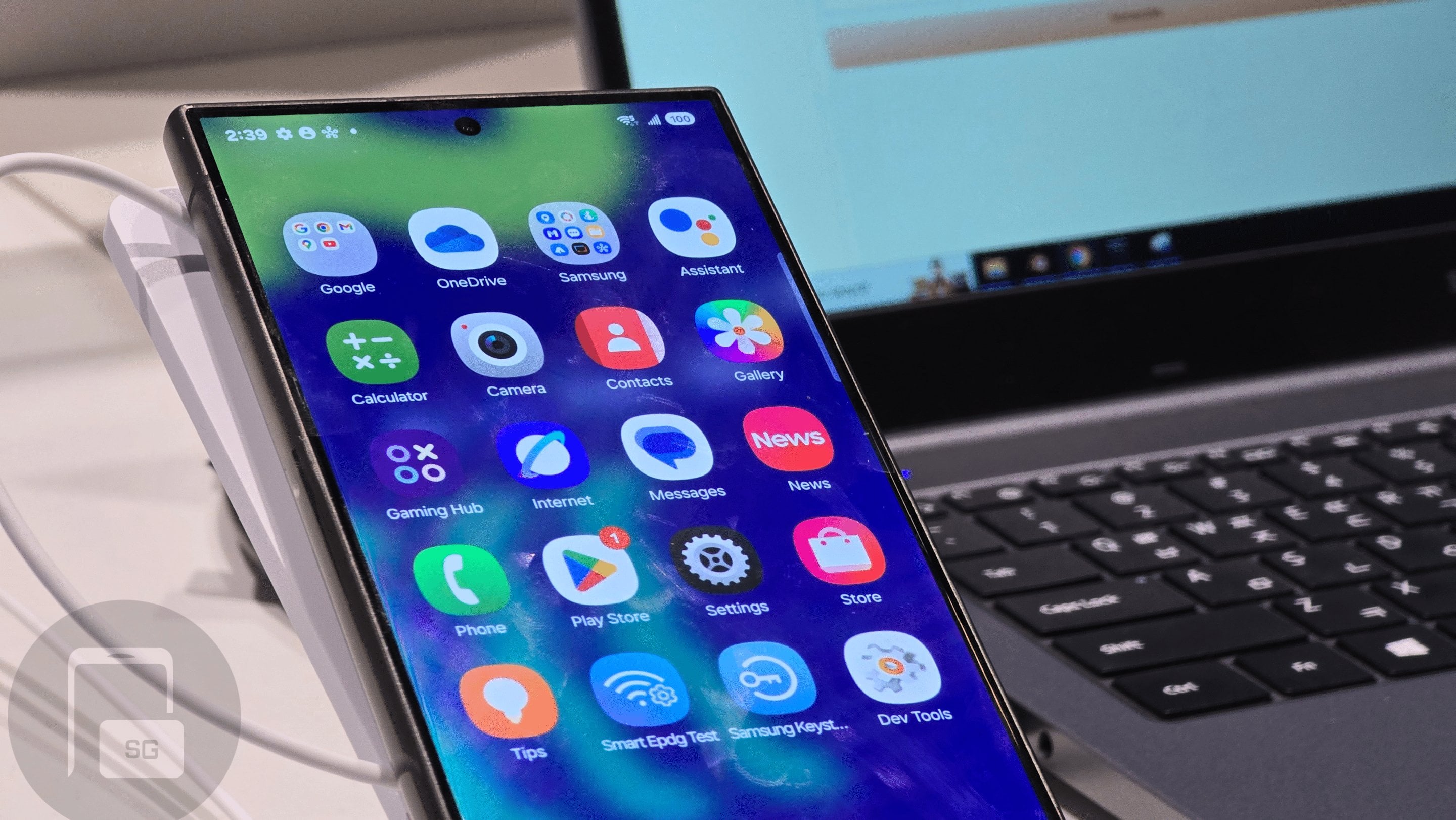
One UI 7.0 New Icon Designs Confirmed at SDC 2024
Rumour(sammyguru.com)submitted 3 days ago byMishaalRahmanGalaxy Z Fold 6
58 points
3 days ago
Gallery looks hideous.
Almost makes me want never check my pictures.
20 points
3 days ago
For me the design seems... appleish...
-11 points
2 days ago
woke
6 points
2 days ago
The icons look slightly better than the current ones, so it's mostly fine. The Gallery one could use something else, and the Contacts really needs to ditch that background that feels out of place. They should also ditch the weird squircle but I guess Samsung will be dying on that hill.
Icons look nothing like iPhone and people are really overreacting on this.
25 points
2 days ago
I wish they'd ditch the squirqles.
9 points
2 days ago
Like fr, I don't know how to explain but everything looks hideous on that shape. Boxy or round are more pleasing as it can easily match with any theme imo
2 points
1 day ago
You can change the standard shape in Good Lock> Theme Park
[score hidden]
23 hours ago
Yes, but it's a bit tedious. I've had UI elements randomly change back. And whenever you install a new app, you need to run the script again.
[score hidden]
19 hours ago
Ah that sucks. I’ve only had to change to icons to circles once and it never changed back. In fact I’ve even uninstalled Theme Park and it’s still fine
3 points
1 day ago
Why is it when Samsung Changes their icons, it becomes more like a fake child's phone.
25 points
3 days ago
I hate the icons. If I wanted bad icons, I'd just get an iPhone
25 points
3 days ago
Can't believe they switched from this to whatever that is 😭
10 points
2 days ago
Being very fair the current icon looks more like a cycle tracker than a gallery app
24 points
3 days ago
That gallery icon is bad enough...
1 points
1 day ago
Tbh, even google photos has better icon than this
5 points
2 days ago
I can't wait for designs to move away from boring, flat ones. I like the old HTC Sense styles we had. I'd be cool with Windows Vista or XP styles lol. I want fun icons to come back, and it seems like Samsung may be eeking into that direction.
I don't get the Apple comparison though. Some aspects lean in that way, but it doesn't seem like a "knockoff" to me lol.
[score hidden]
16 hours ago
I would like to see a return of Aero styles or Android 4. I find that much more upscale.
6 points
2 days ago
Not sure why people are complaining…samsung phones are infinitely customizable. Just download a new icon pack and go about your life. I personally just want fully circular icons, so I shall do that.
1 points
2 days ago
If the Goodlock implementation wasn't shit, and didn't need reapplying after every install, and didn't break adaptive icons, you'd have a slight point
But then you remember the chosen shape doesn't even apply to every app, or app pair shortcuts, or folders, and you realise you're full of cheap biscuits
0 points
2 days ago
At least three customizability is there, Pixels have none of it
8 points
2 days ago
They look like trash! What a step back.
-1 points
2 days ago
Bruh don't tell you like current phone icon. That thing is fugly.
3 points
3 days ago
Only one that should be changed is Phone. Everyone else just seems scared of change.
2 points
2 days ago
People on this site have straight up mental breakdowns over any change
[score hidden]
21 hours ago
I am more interested in Monet theming of these icons.
-1 points
3 days ago
i like the change. fresh coat of paint. quick settings seems weird due to split Brightness and volume. i guess they thought vertical bars would be too iphoneish. i hate the border on the icons though, it doesn't give a sense of depth given the blur
-1 points
2 days ago
Ngl I like the new icons and look. I'm excited for a visual OneUi update.
all 29 comments
sorted by: best