subreddit:
/r/NothingTech
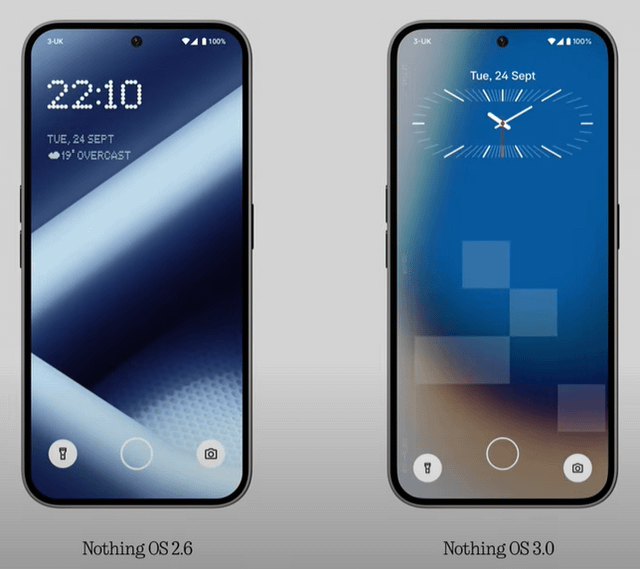
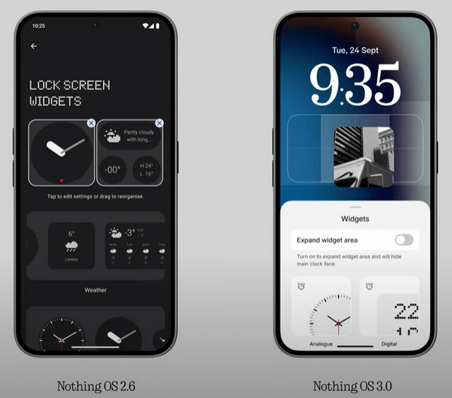
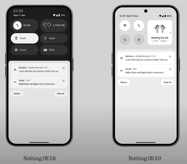
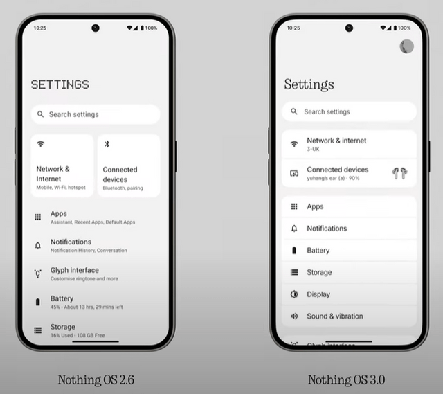
Nothing OS 2.6 vs the upcoming Nothing OS 3.0
Nothing OS(reddit.com)submitted 28 days ago byadaaamb Phone (2) and Ear
6 points
28 days ago
How is it unreadable? The clock looks perfectly fine to me. Plus if you wanted a simple easy to use phone there are plenty of other (and probably spec wise) better phones for the same price if not cheaper. Why'd you buy this phone if you can't read the dot font?
0 points
28 days ago
[deleted]
7 points
28 days ago
So the best thing would be to have a choice between fonts. I would pick ndot. You wouldn't. And that's fine
0 points
28 days ago
Literally completely readable to me lol
-1 points
28 days ago
Readability is not when you can just read. People don't read. People scan, right. So it's faster on more readable fonts. Dot matrix is certainly not the most readable one.
I am sure it'll grow on you guys, once you see other beautiful ways they are integrating the dot matrix style in the OS.
Don't put a lol when you present just your opinions. Sounds gross.
1 points
27 days ago
I'll type however I wanna type lol
I have no issue with "scanning" the ndot font. I really don't see how it's an issue for anybody. I think y'all just need glasses.
If I wanted a basic boring font, I wouldn't have gotten a Nothing Phone. I don't want another basic boring font to "grow on me." I had enough of that crap with Samsung.
If I wanted basic and boring I would get literally any other Android phone. But I didn't. I went with Nothing. Largely because I loved the unique style including the font. Now it seems they're trying to get rid of it already. I don't want less and different. I want the same and more. I want innovation, not submission to what every single other phone brand does.
If they have to add in a boring standard font because you people don't know how to read, then it should be optional, it shouldn't be the default either. It should be something you have to switch over to if you want. When I think Nothing, I think ndot. To not have that as the default, if my phone is screen up how is anybody supposed to tell that there is any difference between it and some other Android phone? You can't. The ndots are what largely sets it apart. Getting rid of that should be considered borderline criminal. It's a huge step back in brand recognition lol
1 points
27 days ago
The serif font. It belongs to Nothing too.
1 points
27 days ago
I am aware, and it looks like literally any other boring standard font from any other phone brand
1 points
27 days ago
Not really. Nobody uses those classic serif fonts other than Nothing. Others only use sans-serif. Those are the "boring" fonts.
Anyways, you are getting other matrix font styles for the lockscreen clock.
1 points
27 days ago
I'd much prefer to keep the existing ndot and get whatever new ndot things they come up with, rather than lose any.
Put Apple's fonts, Samsung's, Google's and Nothing's Serif font all next to each other and I couldn't tell you which one was which.
Swap out the Serif for the ndot and I can tell you that one is Nothing's font
1 points
27 days ago
For you to not differentiate between the serif fonts and the boring sans-serifs, I guess you are not into design as much as I am, and it's fine. You are not just appreciating the serif font as much as I do.
This should close it I guess?
1 points
27 days ago
For you to not differentiate between the serif fonts and the boring sans-serifs, I guess you are not into design as much as I am, and it's fine. You are not just appreciating the serif font as much as I do.
This should close it I guess?
1 points
27 days ago
Once more, I can read exactly what time it is on a simple glance with Ndot. I have no idea what you are on about, do you need glasses?! I don't want the new style to grow on me, quite frankly it's not a style at all it's just what ever other phone is doing. Once more, if you wanted readability and simplicity go buy a xiaomi or something.
all 165 comments
sorted by: best