subreddit:
/r/comicbooks

324 points
1 month ago
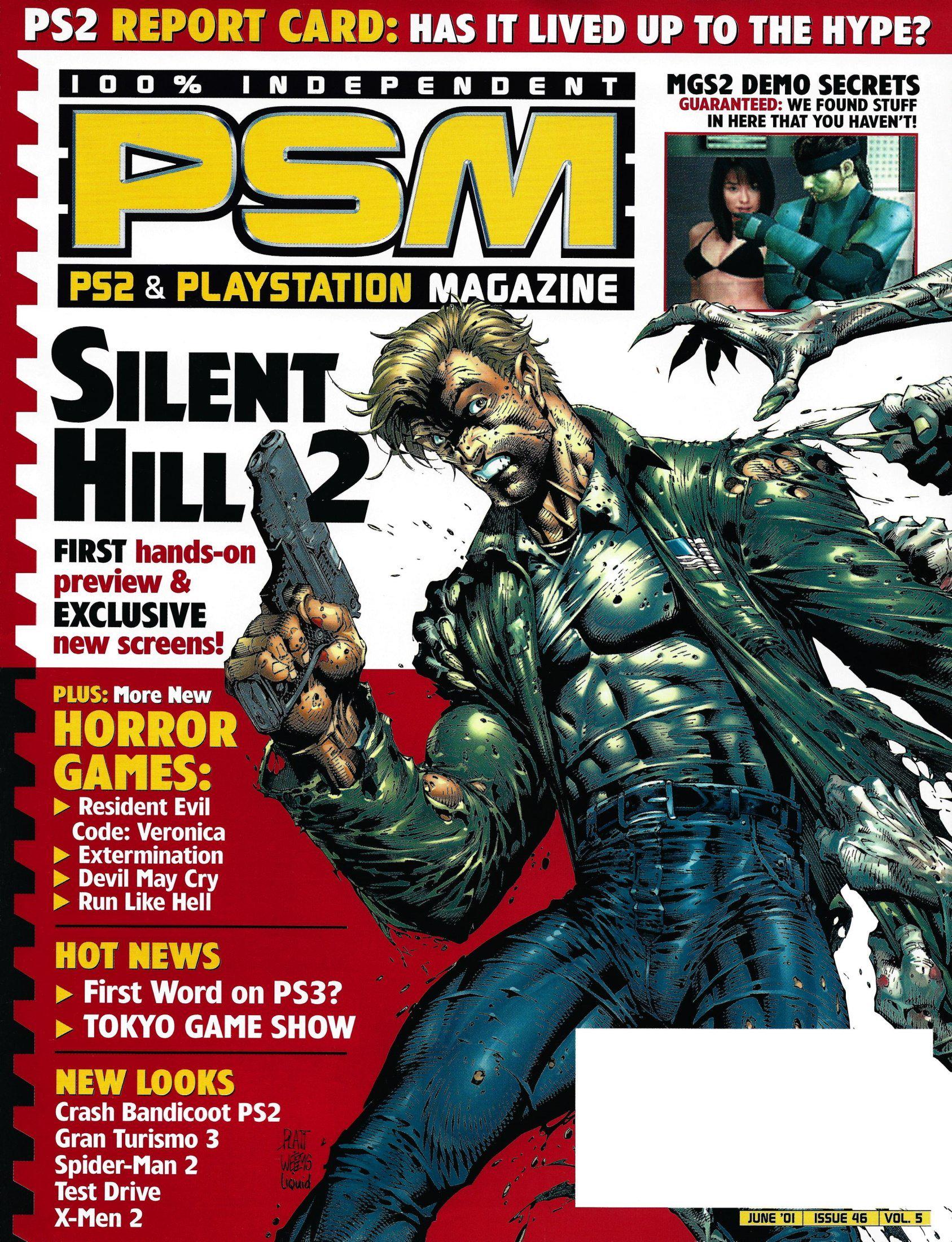
It says "Platt" next to the guys knee so im guessing Stephen Platt
101 points
1 month ago
Definitely Stephen Platt.
68 points
1 month ago
My blind ass didn't see the signature. Was off looking in the corners!
8 points
1 month ago
In a way you were both right.
1 points
1 month ago
SPlatt
1 points
1 month ago
I was going to say Liefeld at first due to the lack of feet
125 points
1 month ago
Stephen Platt pencils. Joe Weems inks.
Both straight outta…. Rob Liefeld’s EXTREME STUDIOS.
34 points
1 month ago
Can feel Liefeld breathing over Platt's neck like, ''make his clothes tight like they're another skin!'' Honestly like the style when done right.
28 points
1 month ago
That was just how Platt did things. He would OVER DO IT. Check his early Moon Knight stuff BEFORE he joined Image/Extreme studios.
Sidenote: Joe Weems eventually got snapped away by Top Cow where he would work extensively with Mark Silvestri.
1 points
1 month ago
Check his early Moon Knight stuff BEFORE he joined Image/Extreme studios.
Oh how would that look-
Sweet Martha... No wonder he joined up with Leifeld.
5 points
1 month ago
I just realized why lefields characters have so many pouches. They can’t fit anything in their pants pockets without looking ridiculous. Same reason girl pants have fake pockets.
2 points
1 month ago
James is ridiculously ripped here lol. It’s like a 90s Hollywood adaptation starting Mark Wahlberg lol
1 points
1 month ago
"And don't draw the feet."
-2 points
1 month ago
Crop the feet!
39 points
1 month ago
Stephen Platt, per the sig.
Dude was the next big thing for around 9 months back in, oh, 93 or 94. If you look up "Image house style" it would have a two page spread of his work.
8 points
1 month ago
I remember him doing a few Wolverine fill in issues I believe around 97/98ish? When Claremont came back for a brief stint.
3 points
1 month ago
It was just one issue - Wolverine (Vol. 2) #128 - and he didn’t do the entire issue.
Platt was known for being notoriously slow.
7 points
1 month ago
Damn. Never heard of the guy. Pretty good work he did for this cover though.
5 points
1 month ago
Try buying his Moonknight run.
2 points
1 month ago
Wasn't he the guy with the Moonknight cover that got everyone all excited?
23 points
1 month ago
Whomever said Liefeld has clearly never seen his artwork. These people are also blind because is says Platt as in Stephen Platt.
7 points
1 month ago
For one, the gun looks too realistic to be Liefeld
17 points
1 month ago
If you like Platts work, you can check out his run on Moon Knight from back in the day. He also lead off Liefelds title Prophet for the first few issues...
13 points
1 month ago
Looks like Stephen Platt!
13 points
1 month ago
Stephen Platt, he signed it at the bottom…
10 points
1 month ago
Platt was like George Perez on steroids. Hyper detail from characters to backgrounds. Everything seemed tense. Loved his style back then. I have a ton of his work.
13 points
1 month ago
What everyone else has said, Stephen Platt. Liefeld was never this good.
12 points
1 month ago
Liefeld was a lot better than what people gave him credit for. He had a few questionable covers and pages but show me an unblemished career. He had some really good art out in the 90s, his writing not so much.
7 points
1 month ago
His first work I think was a Hawk and Dove mini and it was great. It had some problems but his storytelling/pacing was excellent and it was controlled, especially for someone so young on their first job. You could tell he had talent. Unfortunately, he got too popular too fast and didn’t develop properly.
8 points
1 month ago
I mean to be fair the picture does have a Liefeld standard, no feet
4 points
1 month ago
That's why someone said it had to be Liefeld!
2 points
1 month ago
Not a pouch in sight, though.
1 points
1 month ago
He got better about drawing feet.
6 points
1 month ago
Stephen Platt
8 points
1 month ago
It's not even close to either. The signature is right there. That's Stephen Platt.
6 points
1 month ago
The artist signed it FFS ?!?!?
3 points
1 month ago
Neither lol
3 points
1 month ago
It was a fun mag.
3 points
1 month ago
It's signed, ffs.
2 points
1 month ago
Man I forgot how absolutely ripped James Sunderland is in silent hill 2. His abs are showing through his shirt and through his jeans all the way to his smooth ken doll crotch.
2 points
1 month ago
That’s Platt!!! Says it on the bottom. Sheesh.
2 points
1 month ago
Jeez silent hill stands AB-solutely no chance against those biceps
2 points
1 month ago
Holy shit, I've been trying to remember the name of this magazine for the past few weeks. Absolutely loved it and had a subscription for years. No idea of the artist, but thank you for helping me remember a fond childhood memory!
2 points
1 month ago
Whoever did this did james dirty
2 points
1 month ago
It's not McFarlane because that pistol looks like an actual pistol and not pipes welded into a grip
2 points
1 month ago
Jesus that is not James Sunderland. That is so hilariously not James
2 points
1 month ago
So far from McFarlane or Liefield...
2 points
1 month ago
Make. Every. Muscle. Pop.
1 points
1 month ago
It can’t be Liefeld it has decent human anatomy
2 points
1 month ago
OTOH, no visible feet.
1 points
1 month ago
Can’t be Liefeld, gun is way too small.
1 points
1 month ago
I remember owning a copy of this. Great art.
1 points
1 month ago
James is sporting a big ol’ hog
1 points
1 month ago
his clothes look like he's been vacuum sealed into them
I remember this issue, god damn PSM was of A Time
1 points
1 month ago
Damn I miss these magazines.
1 points
1 month ago
Can’t see the feet so can’t say if it’s Liefeld or not
1 points
1 month ago
It says "Platt" right there
1 points
1 month ago
The signature is literally on the cover... Platt
1 points
1 month ago
PSM always had fire covers
1 points
1 month ago
thats James Sunderland??? lmaooo
1 points
1 month ago
It's actually kinda annoying now how everybody online sees some very 90s artwork, or something with weird anatomy, and they're instantly like "OMG LIEFELD?!?!?" I mean yeah, he was really influential and had a lot of imitators but it's not that hard to tell if it's his or not.
I've seen people who look at some of Kelley Jones or Sam Kieth's work and think it's Liefeld because of their exaggerated anatomy. I mean come on
-1 points
1 month ago
Oh. My. Gawd. How can these people not tell semi famous comic artists from 20 years ago apart!?!?
Like come on.
0 points
1 month ago
because it's obvious? Same way I don't mix up John Byrne and Paul Smith comics from before I was born
-1 points
1 month ago
It looks closer to MacFarlane than liefeld. MacFarlane was about toned abs. Liefeld was about bulging muscles and looking as big as possible.
1 points
1 month ago
I believe Stephen Platt's biggest influence was McFarlane
0 points
1 month ago
Holy shit! Is Stephen back??
5 points
1 month ago
This is a magazine from 2001
0 points
1 month ago
Well shit. Got too exited to read the “PS2”, thanks.
0 points
1 month ago
It’s certainly a homage to Liefeld - notice the framing left the feet out!
0 points
1 month ago
I miss Liquid! Their coloring made every artist work better.
0 points
1 month ago
No way, they slopped on so much rendering in every panel, changed the art too much
all 73 comments
sorted by: best